Pitfall Avoidance Guide! 12 Details You Must Check Before Printing!
Prepress checking is an important step to ensure that the design intent is accurately and intact transferred to the physical product. Strict prepress inspection is an effective way to control printing risks, costs, and quality. There are 12 details in prepress checking that require special attention:
01
Bleed Line
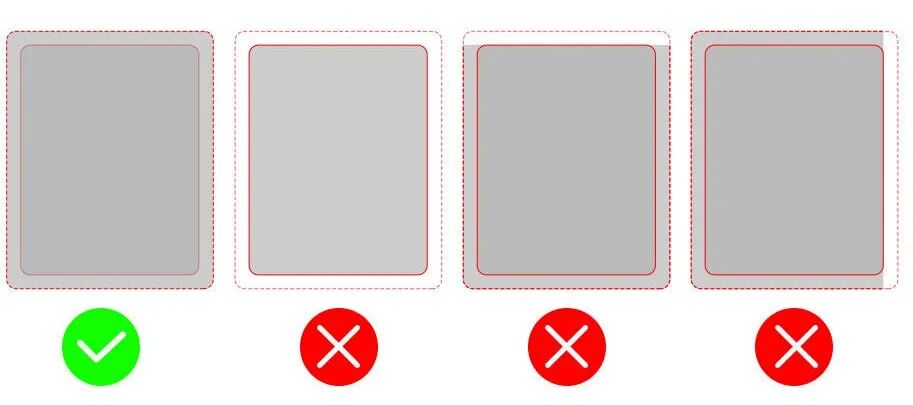
Reserve at least 3-5mm of space in the bleed area to prevent content from being trimmed or leaving blank edges.
02
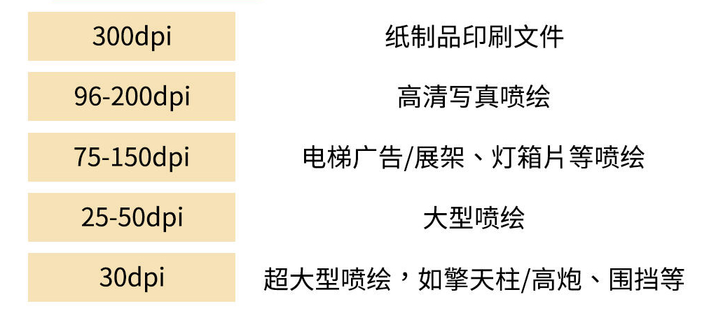
Resolution
03
Font Outlining
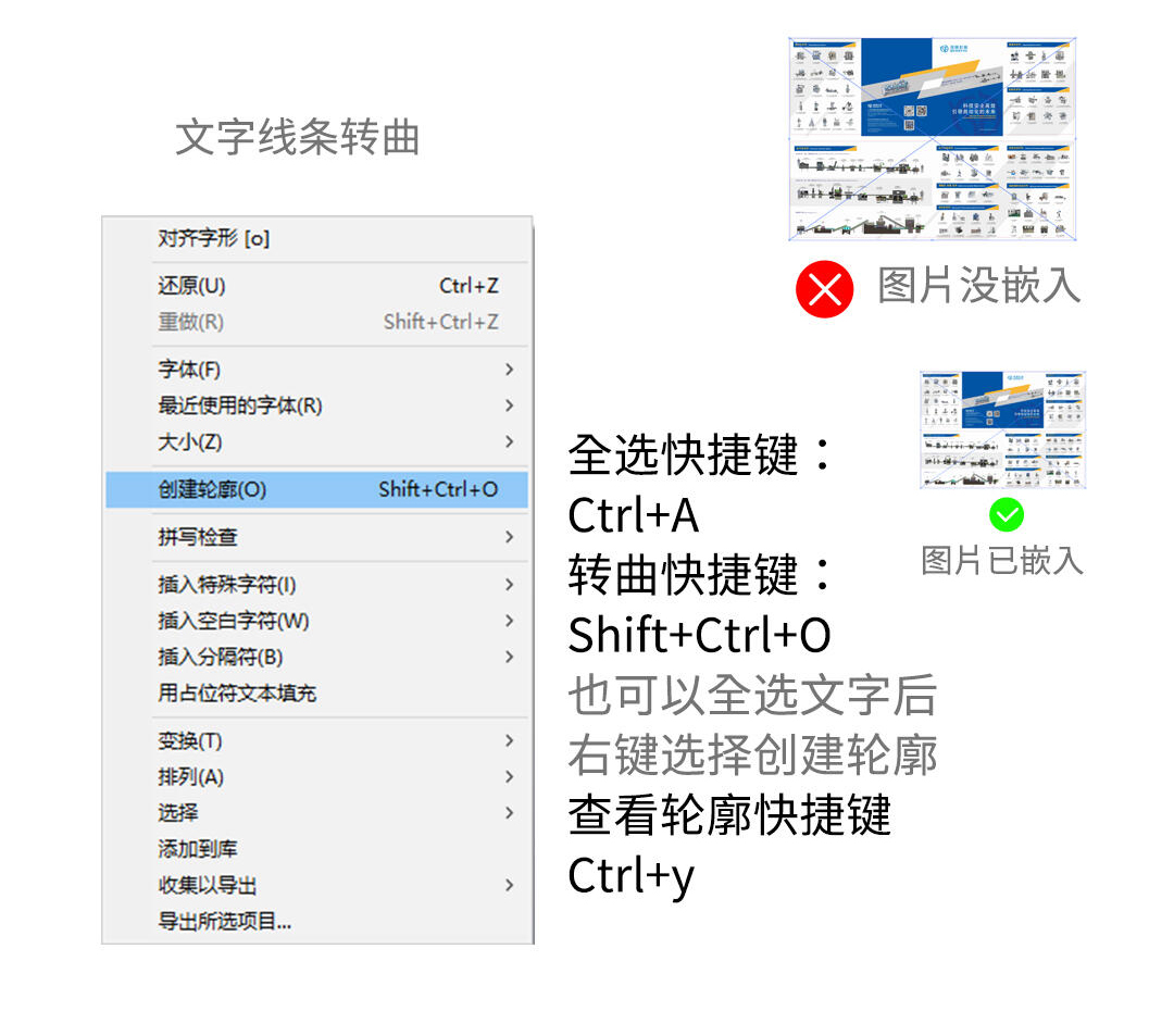
To ensure that fonts and images are not lost, it is recommended to convert all fonts and lines in the production files to outlines and embed all images. For projects that contain a large amount of text and are inconvenient to convert to outlines (such as books or magazines), you can also consider packaging the fonts and images together.
04
Color Mode
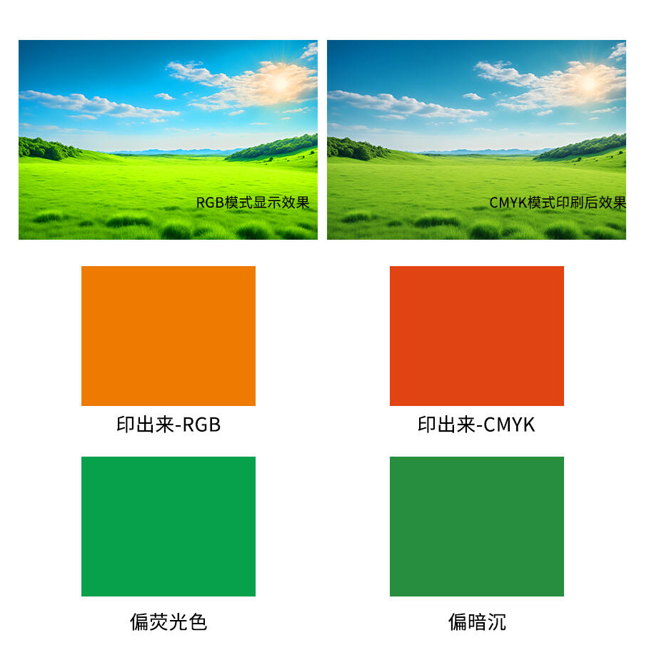
The color mode of printed materials must be set to CMYK. RGB is the color of light sources and is suitable for electronic displays, while CMYK is the color adjustment suitable for printed materials. If RGB mode is mistakenly used during printing, there will be a significant color difference on the paper.
05
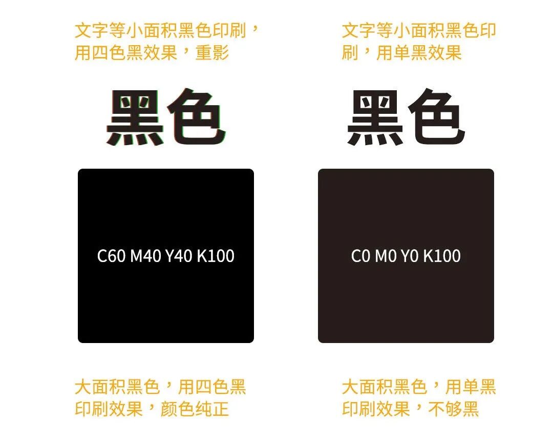
Avoid using four-color black for small-sized text
When printing body text, QR codes, and other small areas of black content, it is recommended to use single-color black. Using four-color black may cause misalignment during printing, resulting in ghosting and a dirty appearance. For large areas of black printing, using single-color black may cause the color to appear gray, in which case four-color black should be used.
06
Check Color Values
The fewer CMYK channels used, the cleaner the color. In each CMYK color channel, if one color value is relatively small, the smallest channel value can be adjusted to 0. Try to avoid the values of the three CMY channels being too similar; if a color can be created using two channels, do not use the third.
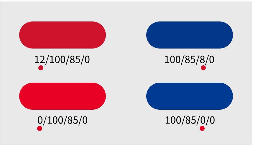
Upstream: More channels, colors appear dirty
Downstream: Fewer channels, colors cleaner
07
Check color values
Color or image opacity should not be lower than 10%. Opacity below 10% may result in the printed product not displaying properly.
08
Check file fonts
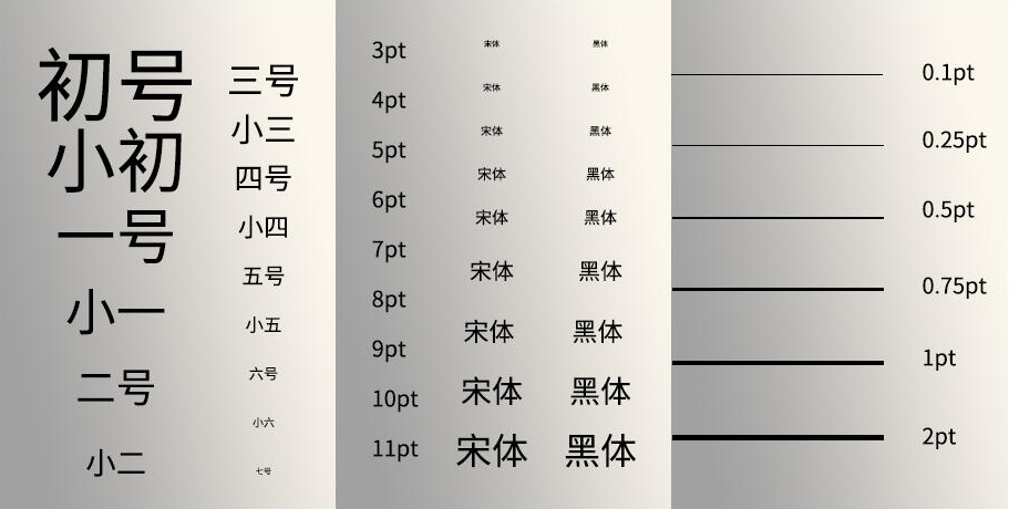
Font copyright: Free for commercial use?
Font size: above 6pt
Line thickness: >0.25pt
Reverse text: >10pt; reverse line thickness: >0.5pt
09
Check Margins
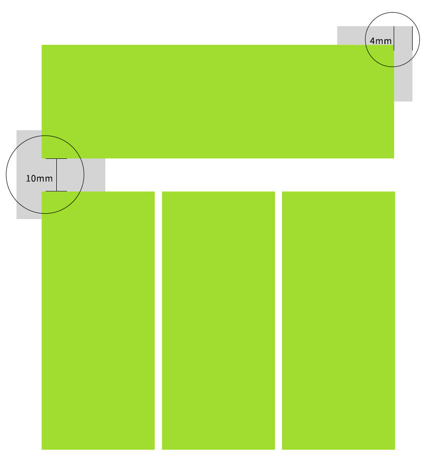
Do not place images and text in the print file too close to the edges; leave at least 4–6mm of space. In addition, when arranging the layout, leave at least 10mm of space between images to avoid accidental cutting during trimming.
10
Process/Dimension Marking
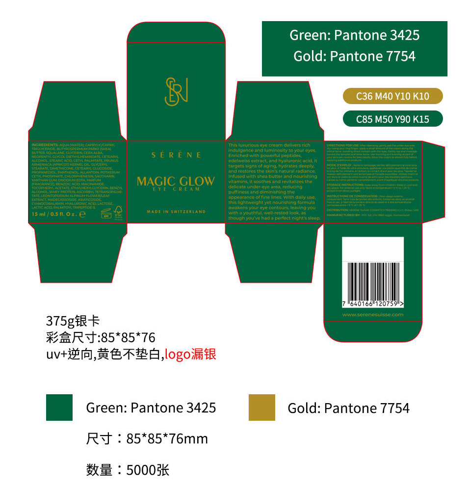
In order to reduce unnecessary rework, the design documents must indicate quantity, dimensions, process requirements, and clearly mark the Pantone color numbers where special colors are needed.
11
Content Proofreading
The proofreading process for book publications usually requires three rounds of proofreading and three rounds of corrections. Although daily printed materials are not as strict, it is still necessary to carefully check for typos, grammatical errors, and relevant legal requirements when outputting production files.
12
File Output
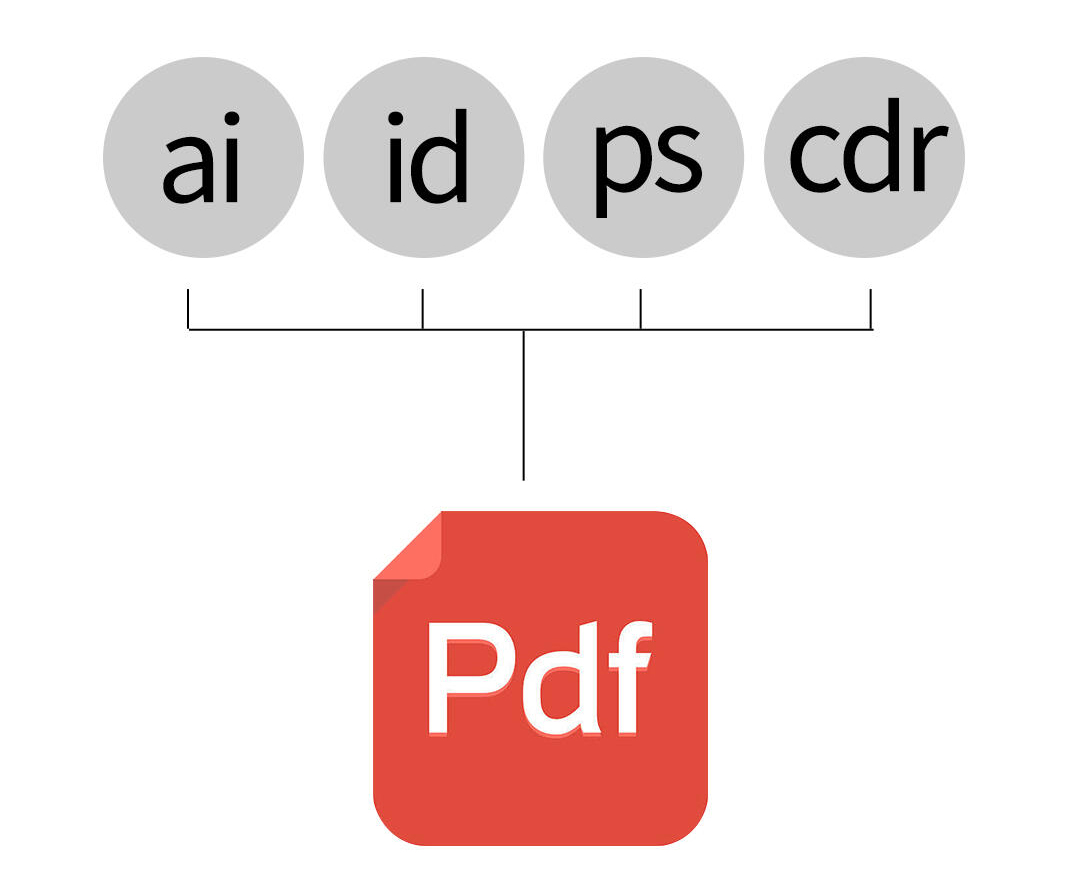
After checking all the content, the files received by the printing factory should preferably be in PDF format, as it is compatible with various software and easy to transmit.
Reminder: Remember to proof the sample before mass printing to check the results.