6 moves! Let business printing design showcase a sense of sophistication!
In business printing, graphic design is a crucial aspect before printing. To achieve high-quality visual effects, the visual class must pay attention to it. Visual hierarchy refers to the arrangement of elements in a composition based on their importance. By adjusting size, width, spacing, position, color, or font, it can attract the audience to view the design work and ensure the transmission of clear and concise messages.
Whether designing business cards, brochures, posters, flyers, product samples, calendars, or magazines, visual hierarchy can enhance spatial composition. Adhering to the following six basic principles can quickly improve skills and highlight the high-end feel of the product.
Apply color
Any element in the design composition can use color to create a stunning effect on the entire graphic design. When designers consciously use colors, they can create a focus of attention for readers.
Strategic use of color can highlight headlines, secondary information, names, and other important details. These elements are the key information that companies want readers to pay attention to in the first place. Other less important elements such as event locations and contact information can be created with the depth of colors to create a stepped visual effect, usually placed after the title.
The display sign created by Petr Kudlapek in Figure 1 emphasizes the power of red and vividly interprets it on light and dark backgrounds. The saturation color of the title can immediately attract the audience's attention, and then guide them to appreciate the entire composition, thereby understanding the information of the entire sign.
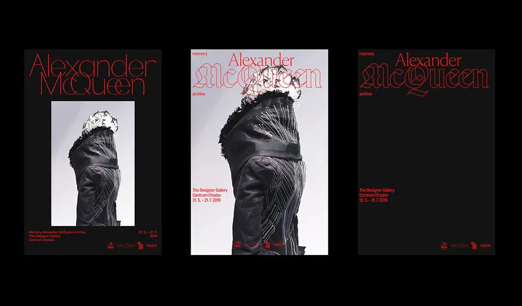 Figure 1: Alexander McQueen's Display Sign by Petr Kudlapek
Why use a strong color like red in composition? Red is known for its ability to attract people, which is also the reason why traffic signal stop signs, promotional banners, and phone notifications use red. Red stands out immediately when compared to darker colors or when combined with other warm tones, while cooler tones become blurred in space.
Is the color scheme integrated into the background of the poster shown in Figure 2, and can it attract attention? Strategically consider the colors used in the work to avoid confusing the audience. Choosing the best color scheme during design means evaluating the psychology of the selected color and its expression in the design environment. Test the compatibility of different color schemes throughout the entire work, as harmonious color schemes affect the mood, tone, and readability of the work.
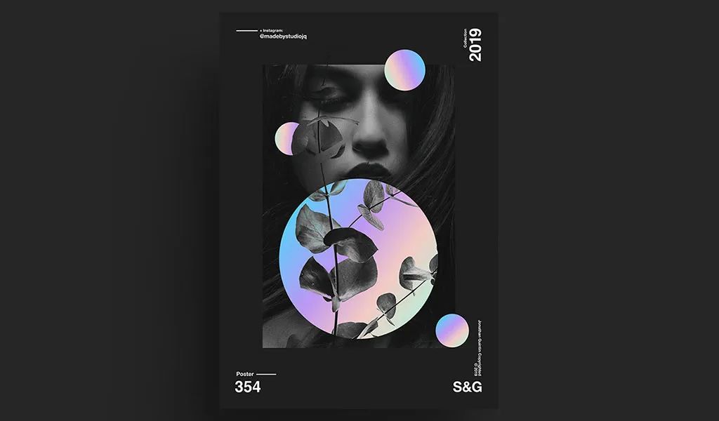 Figure 2: Poster Design for Show&Go by Jonathan Quintin
Use size and proportion to represent importance
Size is important. In graphic design, elements that occupy a larger area can be noticed first. This principle explains why the titles and other important details presented in print media are usually larger than the content. However, it is not only fonts that can be applied in terms of size and proportion, but also images, drawings, symbols, and shapes, all of which can benefit in this regard.
As shown in Figure 3, when we look at the music poster above, pay attention to the first part that stands out. The word 'HUSH' is like shouting at someone in court. The size of the title itself is quite large, but when compared to adjacent small text, this character occupies a large proportion, which is very obvious, and the effect it produces is also evident. In Figure 3, one can clearly feel the hair difference effect generated by applying font hierarchy.
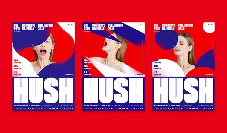
Figure 3: Poster of Hush Full Music Concert by Au Chon Hin
When using size and proportion to convey hierarchy, it is best to have a clear distinction between the focus and all other design surfaces, as shown in Figure 4. If the proportions of the title and other elements such as images are similar and not distinguished, people may feel visually confused and unable to distinguish the key points when viewing the design.
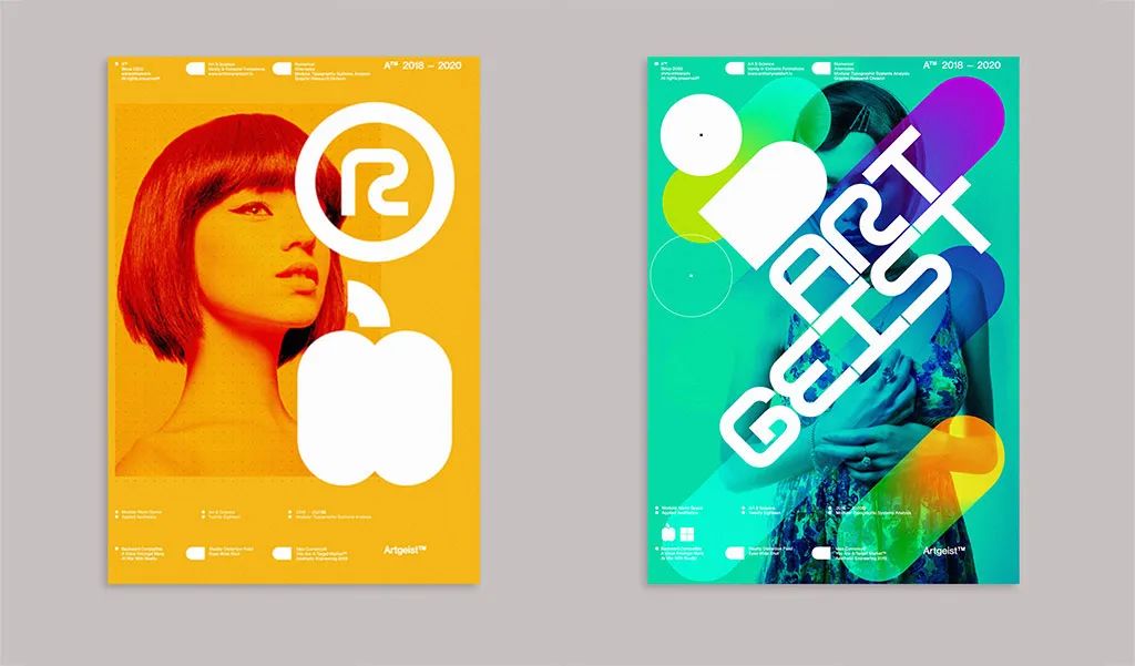 Figure 4: Poster Design of TypeGeist by Anthony Dart
Using font selection to establish hierarchy
Another aspect of successful composition is the use of excellent fonts and pairings to create hierarchy. No matter how many fonts are used in the composition, choosing the appropriate font is crucial for conveying the message. Whether incorporating serif, sans serif, or handwritten fonts, every style needs to match the design.
Using handwritten fonts in professional financial banner advertisements may result in a mismatch between the font and the content. To avoid using unrelated elements, designers must be familiar with the characteristics of each font, as shown in Figure 5. Do the fonts of each element match? Is the style too similar? Or, will there be conflicts between fonts? These are all issues that need to be considered, therefore, the font selection for each element in the design is crucial, and of course, font copyright should also be taken into account.
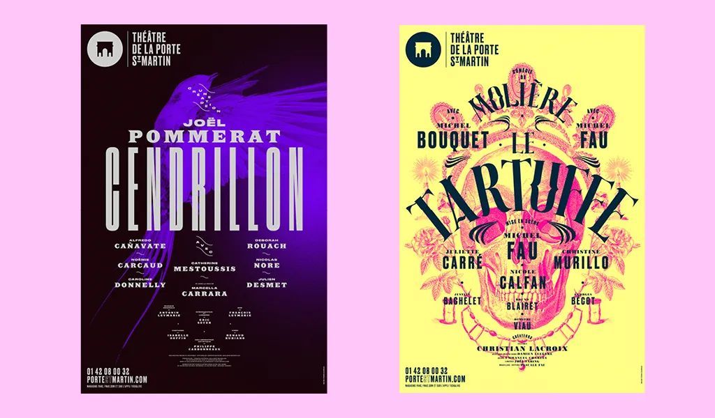
Figure 5 Poster Design of Th éâ tre de la Porte St Martin
Author Pierre Jeanneau
In examples where fonts occupy a large part of the composition, such as menus and invitations, font hierarchy is the key to confirming the readability and readability of information. Readers hope to easily find details instead of browsing the file back and forth several times.
Regardless of whether the designer chooses three fonts or one, the primary (first level text), secondary (second level text), or third level (third level text) order of reading text should be clearly defined and presented very clearly. Important information such as titles, headlines, or names are usually the first part to read, followed by additional details, as shown in Figure 6.
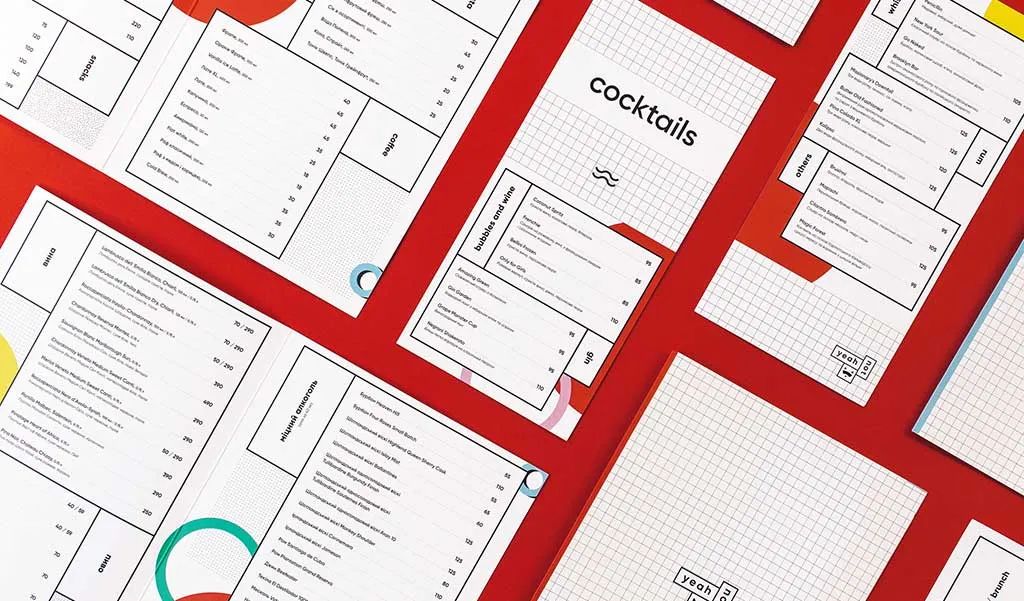 Figure 6: Yeahnot's Menu Design by Marina Mescaline
If the overall composition uses the same font and style, font width and different sizes are the best ways to reflect differentiation. Many font families have three or more width variations, which can maintain design consistency while maintaining hierarchy.
Embrace negative space
Negative space, also known as blank space, refers to the space around a specific object. Whether it is a title, image, or drawing, negative space is needed to highlight it, as shown in Figure 7. The importance of this open space for composition is equal to that of objects. It can provide breathing space for the work and fully guide the audience in the design. Negative space can not only isolate different entities, but also assist in establishing hierarchy and organization. To emphasize the specific aspect of the design, the negative space around the object can be appropriately increased, which separates key elements and allows the audience to directly reach the focus.
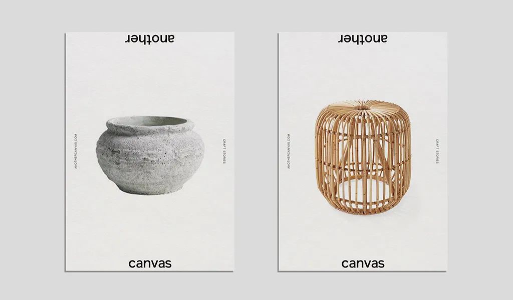 Figure 7 Canvas poster design by fagerstr ö m
Use alignment function to organize information
If a large amount of information is placed on a single page, the composition will give the impression that it is all text. One technique for organizing a composition is to use text alignment and negative space. By categorizing text into different levels (headings, subheadings, and body text) and aligning them as needed, viewers can more easily read page information.
As shown in Figure 8, the first level text (such as the title) is usually very large in the composition. Align the title to highlight its importance. Subtitles (also known as second level text) are often longer, but still aligned in the center. Finally, it is best to align the content (third level text) to the left, as this section is not unimportant. Aligning large blocks of text to the left can make it easier for viewers to browse the work and obtain information.
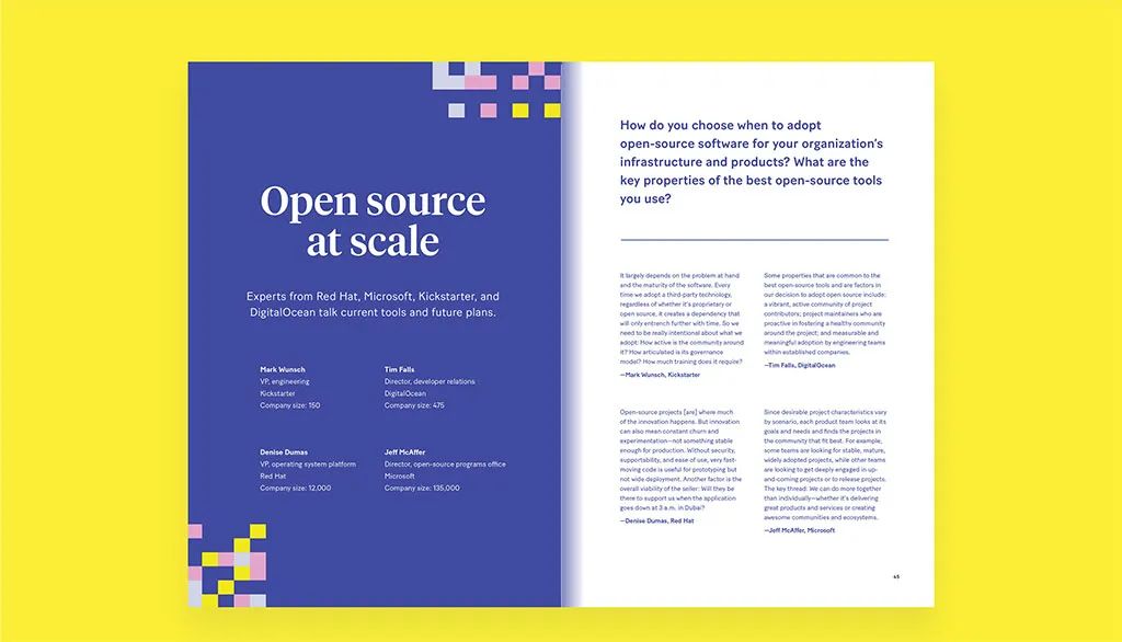 The magazine cross page for Increment Issue 9 in Figure 8,
Although alignment usually refers to text layout, designers can also apply this principle to patterns, lines, or other drawings. Using a grid based approach to design helps maintain a sense of overall area.
Proficient in comparative art
Successful design depends on contrast and impact to bring visual interest to people. There are many forms of comparison: through color selection, font style, pattern, color temperature, saturation, and brightness. Comparison can also prevent designs from becoming monotonous and flat.
To establish a visual hierarchy through contrast, the focus can be contrasted with other parts in the design to make it stand out. If using serif fonts throughout the work, try using bold sans serif fonts to attract attention. Instead of keeping the image in a cool tone, you can try using warm tones in different areas, as shown in Figure 9. Mastering the art of comparison can enhance the texture of simple designs.
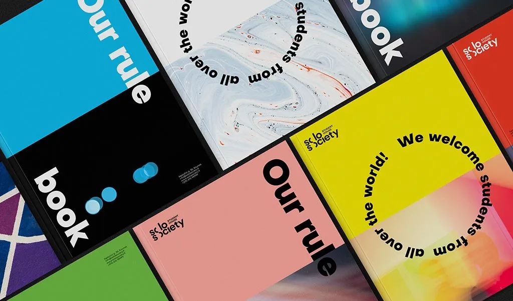
Figure 9: Brand Identification of Solo Society
The above 6 points to improve the visual level of designers hope to help peers in the field of business printing.

