


When should you use/replace the Pantone color formula guide?
When Should You Use the Pantone Formula Guide
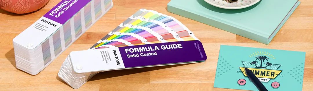
If you're a designer, then you're probably very familiar with the Pantone Formula Guide. Since 1963, the Pantone Formula Guide has been providing designers around the world with color inspiration, standards, and validation. As a practical and efficient color tool, it can save you time, effort, and money as much as possible, avoid many hassles, and make communication with colleagues, clients, and suppliers much smoother.
When you want to improve communication efficiency
You might, like many designers, have received comments like this: "Make the blue a bit darker, but not too dark," or "Use a light pink, not a bright pink." Ambiguous and highly subjective perceptions of color can lead to ineffective communication and results that neither side is happy with. With the Pantone Formula Guide, you can eliminate these uncertain color factors, because the guide arranges colors in order, allowing you to instantly compare all shades of the same color family. When selecting colors with a client, you can clearly ensure that everyone sees the same color.
When you want to reduce color differences
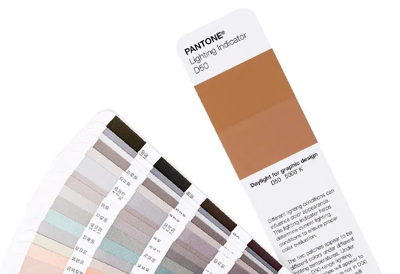
When checking print proofs or samples, think about that dress that caused a huge debate online. Whether you saw it as blue-black or white-gold, we have to admit that proper color evaluation is crucial. Using the Lighting Indicator page in the Pantone Formula Guide to determine the optimal lighting for assessing colors can help avoid unnecessary disagreements. As shown, when the lighting is ideal, the two colors on the indicator page will match perfectly; when the lighting is poor, the colors will appear different.
When You Have No Color Inspiration
Only 4 hours left until the deadline, and even after having two double espressos, your mind is still blank and you have no ideas. What should you do? The Pantone Formula Guide can be your handy assistant. It offers 2,161 commonly used colors on the market, arranged by color family. You can carry it with you and let the rich Pantone colors spark your creativity, allowing you to mix and match colors anytime, anywhere.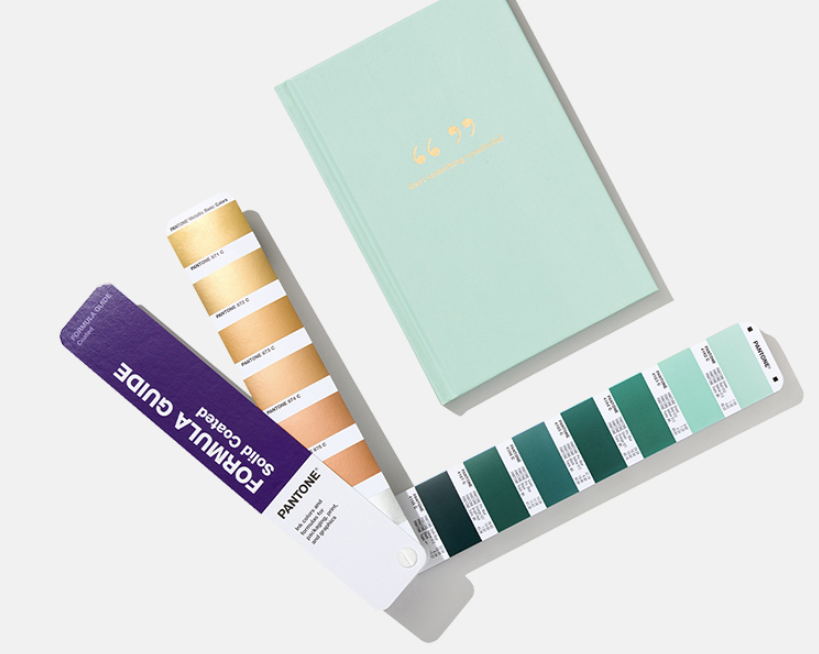
When you need to use other Pantone tools
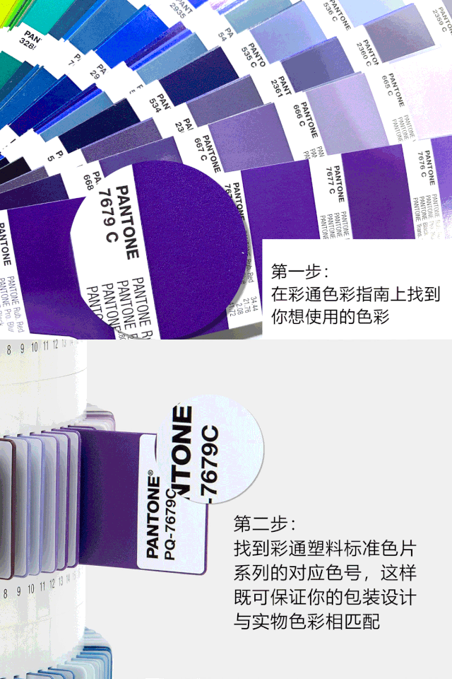
When you're designing a logo for a new bottled drink, because each plastic chip has a Pantone Matching System (PMS) color code, all you need to do is settle on the ideal color in the formula guide, and you can find the corresponding Pantone Plastics Standard Chips Collection color using the code. This way, your packaging design will perfectly match the bottle.
When you want to consistently display colors
Colors often show subtle differences on different materials. For example, the printed effect of colors can vary between glossy coated paper and matte offset paper. Glossy coated paper has a shiny surface, like what you usually see in magazines. It's ideal for sharp, complex designs because the ink sits on the surface and prevents bleeding. Offset paper has a more porous surface, which easily absorbs ink, and is often used for stationery. It can show how colors are reproduced on shipping boxes, stationery, recycled paper, and other offset materials that absorb ink easily.
When Should You Update Your Pantone Guide
New colors and old guides mean you're missing out on colors!
New colors, new possibilities!
Pantone is proud to introduce 224 new colors and 5 base inks, giving designers a wider range of creative expression and freedom. Having the right color choices is crucial when making design decisions. We now have a total of 2,390 market-driven Pantone spot colors-imagine the endless creative possibilities! In our new global color communication tools series, you can discover:
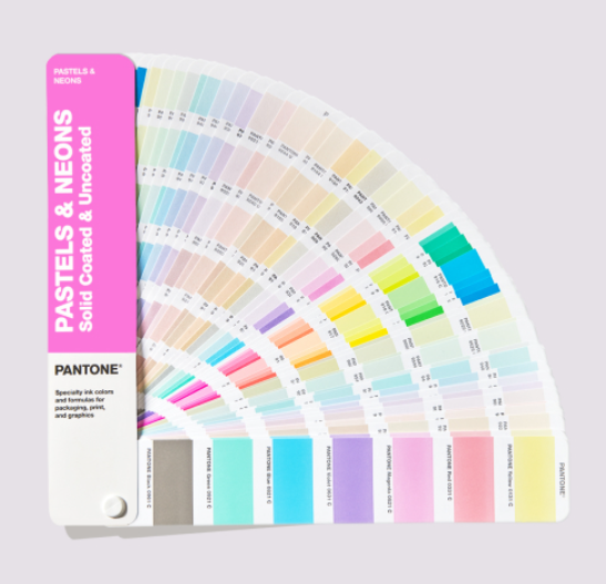
A total of 2,390 market-driven Pantone solid colors [Solid PANTONE Colors].
New colors appear in the Pantone Formula Guides, Solid Chips, and Color Bridge Guides.
Collaborating with major brands to develop popular colors that meet the modern packaging industry's expectations.
Emphasizing specific color ranges derived from market demand. The industry asks us for colors, and we respond to these common requests.
229 new ways to drive creativity.
Bring color into your digital life – learn how Pantone Connect for Adobe® Creative Cloud® lets you bring real Pantone colors into your digital workflow via Adobe Creative Cloud (InDesign®, Photoshop®, and Illustrator®).
Why update?
If you haven't updated your Pantone guides and color books for a few years, your colors may no longer fully meet market needs or be reliably accurate. Colors can fade and yellow within 12-18 months, meaning you need to replace guides and color books to ensure consistency. To learn more, read here on how updating your guides can save you valuable production time and money.
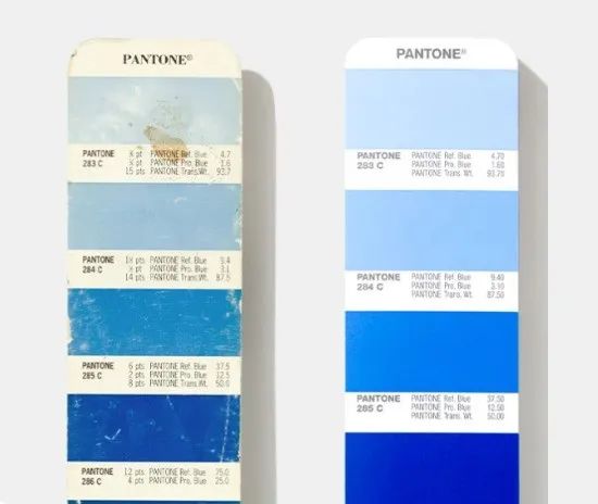
These products include new formulas and are made with new base inks that are compatible with coatings during printing. They're free of barium and contain 65% plant-based ingredients, making them more eco-friendly. The Pantone guides and swatch books are made to the highest standards. We make sure each version has:
- Consistent high-standard ink formulas
- Printed on the most common commercial-grade 100 lb and 80 lb book paper
- Carefully monitored production to avoid defects
That said, while we know you might want to keep them forever, due to handling, fading, and aging, the colors become inaccurate over time. On average, the guides need to be replaced every 12 months (depending on your usage and how you store them). Pantone recommends updating your guides every 12 to 18 months because everyday use and exposure can make the colors inaccurate.
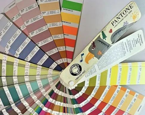
Contact = Natural oils from fingertips can smudge and remove pigment
Paper rubbing = Scratches or removes pigment
Light damage = Fading
Paper aging = Yellowing effect
Environmental humidity = Accelerates paper aging