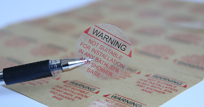
Small text blurring and color differences from the sample occurred during printing... It turns out the problem was here.
Printing BlurringPrinting blurring is also a common issue in adhesive label printing. It mainly manifests as fine text or halftone dots in the graphics being smeared by the ink, making them unclear. In severe cases, it can lead to printing defects. So, what are the causes of printing blurring? In the author's view, there are three main reasons:01Excessive Ink AmountThe most common cause of printing blurring is an excessive amount of ink. In principle, the amount of ink should neither be too much nor too little. During the printing process, only by maintaining the right balance of ink can the color difference of the printed product be kept within the allowable range. If the ink amount is too large, it will cause printing blurring. Therefore, it is necessary to control the ink amount, especially when printing fine text and halftone dots.02Ink Too ThinAdding too much ink reducer or having too high a workshop temperature can cause the ink to become too thin. When the ink is too thin, its fluidity increases, making it difficult to control the amount of ink on fine graphics or halftone dots, which easily results in blurring. Therefore, it is essential to control the viscosity of the ink, ensuring it is neither too thin nor too thick, to prevent blurring during printing.

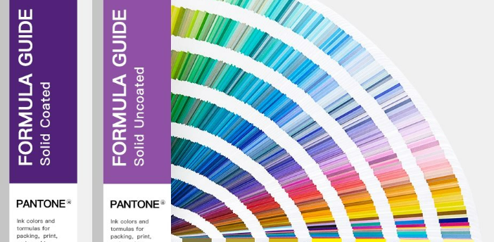
03Printing Design DefectsUsually, traditional printing with four color groups is sufficient, but adhesive label printing equipment generally starts with six color groups, and the mainstream equipment today uses 8 to 10 color groups. On one hand, adhesive label printing requires spot color printing, which means more color groups than traditional printing; on the other hand, it addresses some issues encountered during prepress design.Currently, adhesive label printing mainly uses letterpress and flexographic printing. Although there are no issues with ink-water balance, new problems have arisen. For example, when printing the same color for both fine text and large solid areas, it becomes difficult to control ink volume. Issues are more pronounced if they are printed in the same ink channel. Since different pattern areas require different ink amounts, ensuring sufficient ink for large areas may result in blurred prints for fine text and halftone dots.The best solution for such problems is color separation printing. Even for the same color, fine text and large solid areas should be printed separately. This allows different ink channels to adjust the ink volume according to the needs of the text and graphics. Therefore, prepress design must fully consider this issue.Color MalfunctionsBesides the major issues of poor ink adhesion and blurred prints, color malfunctions with UV inks are also common during printing.01The color of spot ink differs from the sampleIn letterpress printing, spot inks often need to be custom-mixed, but many printers report discrepancies between the mixed ink color and the sample. The main cause is incorrect ink ratios. Spot inks are mixed from multiple primary inks, and since most UV inks follow the PANTONE system, the mixing ratios are usually taken from the PANTONE color chart. However, the ratios on the PANTONE chart may not always be entirely accurate, sometimes differing slightly. This requires printers to rely on their experience, as well as their sensitivity to ink color. Printers should learn and practice continuously to accumulate experience and achieve proficiency.

What I want to remind everyone here is that not all inks are based on the PANTONE color system. When dealing with inks not based on the PANTONE system, you cannot follow the ratios in the PANTONE color guide, otherwise it will be difficult to achieve the desired color. In addition, many printing factories nowadays are equipped with electronic scales to ensure the accuracy of ink ratios, which is also worth encouraging because standardization is an important part of industrial production progress. After mixing the ink correctly for the first time, you can record the weight ratios of the primary colors used to make this ink for future reference in production.02Color discrepancy after CMYK overlappingThere have been many times when I encountered four-color printing jobs where the color during proofing differed significantly from the sample provided by the client. This problem is mostly caused by the difference in dot size on the printing plate compared to the sample.When this situation occurs, first use a specialized screen ruler to measure whether the screen ruling of the sample and the printing plate are consistent. This is very important. If the screen ruling is not consistent, adjust the printing plate to match the sample. Next, use a magnifying glass to examine whether the dot sizes of each color on the printing plate are consistent with the sample. If they are not, adjustments need to be made to match or approximate the sizes. Finally, check whether the hue of the primary inks used for the proof matches that of the sample inks. Generally, if these three aspects are found to be basically consistent with the sample, the printed proof will not differ significantly from the sample.

