Is there a large color error in CMYK printing mode? Uncovering the pitfalls of color in printing
During the printing process, we may often encounter situations where one color appears on the screen and another color appears on the printed product. Slightly reddish, greenish, or deep or light Can we blame the designer for these problems? The answer is negative! Today we will talk about the pitfalls of color in printing.
Is there still an error when printing in CMYK mode?
There are several possible reasons for color difference when printing in CMYK mode:
(1) The color gamut of CMYK is smaller than that of a regular screen.
(2) Combined printing and printing environment can cause a color difference of 10% to 15% in printed materials, resulting in errors compared to the actual CMYK colors.
(3) Each type of paper has different ink absorption, which means the final product effect is different.
(4) The computer displays light and dark colors clearly, but when the CMYK total color value is less than 8% or greater than 250%, the color difference of the printed product is not significant.
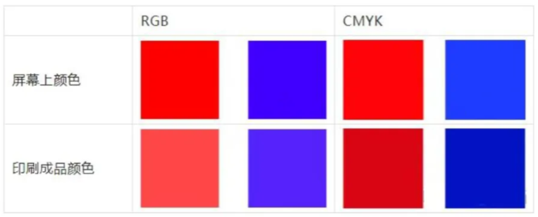
88/1000
Reference Knowledge 88/1000 Reference Knowledge 88/1000 Translation Machine · Comparison of Colors between Silk Screen and Printed Materials in the General Field Using Special Colors to Avoid Large Color Differences Special colors, also known as Pantone, use pigments to metaphorically refer to special colors as ready-made pigments; Four color printing is made using CMYK four pigments. Translation Machine · General Field Comparison of Screen and Printed Product ColorsUse special colors to avoid large color differencesSpecial colors are also known as Pantones, and using pigments to metaphorically refer to special colors is a ready-made pigment; And four-color printing is made using CMYK four pigments.
划译
机翻 · 通用领域
Comparison of Screen and Printed Product Colors
Use special colors to avoid large color differences
Special colors are also known as Pantones, and using pigments to metaphorically refer to special colors is a ready-made pigment; And four-color printing is made using CMYK four pigments.

Difference between special colors and printed colors
PANTONE color does not necessarily mean that it cannot be adjusted using CMYK, but it can be used as a color standard because it can be printed with reference to PANTONE color. PANTONE colors have corresponding CMYK color values. Although the colors produced by CMKY may have some differences from PANTONE colors themselves, spot colors are generally very similar to printed colors.
Colors that require special attention
01
metallic color
The metallic color on the Pantone color chart is different from the hot stamping and silver stamping processes in that it does not have a strong metallic texture, but the touch is relatively smoother. On the Pantone color chart, metallic colors are usually three digit numbers starting with 8.
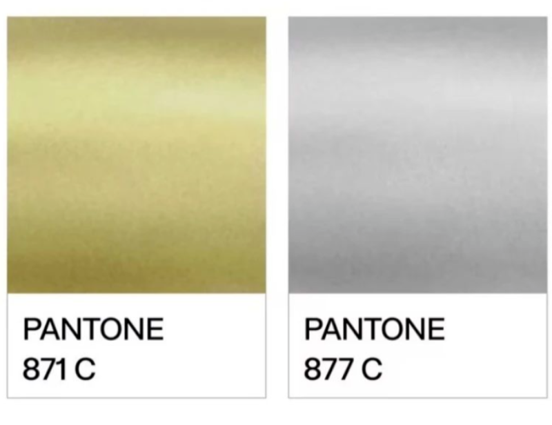
Metallic color on Pantone color chart
02
dark blue
When using the three primary colors for dot free printing, deep blue is the same as other colors without significant color difference.

Three color printing
However, if the two primary colors are mixed together, as shown in the comparison below. The color difference of deep blue is the greatest, as long as the red ink is reduced a little, the color will become colder; If the blue ink is reduced a little, the color will become warmer. This is the most difficult problem to solve because each ink, regardless of the brand, actually has different color cast phenomena.
 Effect image of mixing two primary colors together
03
Purple;
Printing purple is difficult to control, whether it is dark purple or light purple, the color deviation is not a little bit.
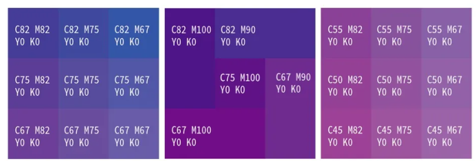
Purple comparison chart
04
Coffee color and four-color gray
Due to the wide range of colors that four-color gray can appear in, it is easy to cause color deviation in printing. Here are only a few obvious contrast images displayed.
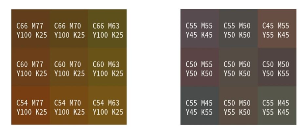
Coffee color (left) and four-color gray (right)
05
fluorescent color
Fluorescent color is a highly saturated color, and it should be noted that unlike fluorescent ink, fluorescent color does not contain luminescent components, so it will not emit light at night.
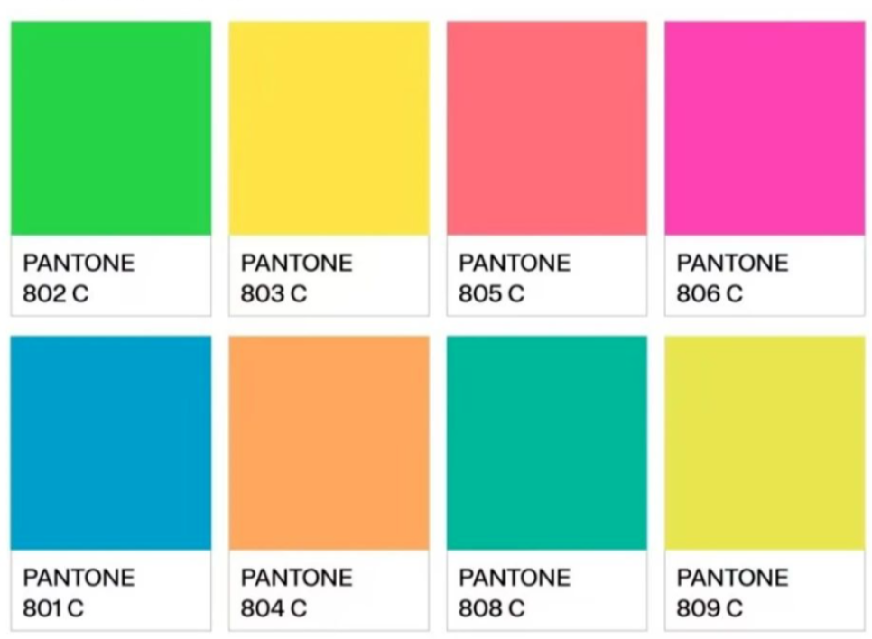
Pantone color card fluorescent color
The 'black' that often causes problems in printing
Do you often directly color in RGB, and after converting to CMYK, black becomes C93, M88, Y89, K80. Little do you know that this black will make the back of your printed materials dirty. Look at the "black" in this setting, each color covers over 80% of the ink. During rapid printing, the ink has not yet dried completely, and the next sheet is already printed on top of this one, so it will definitely get wet with ink and dirty the paper.
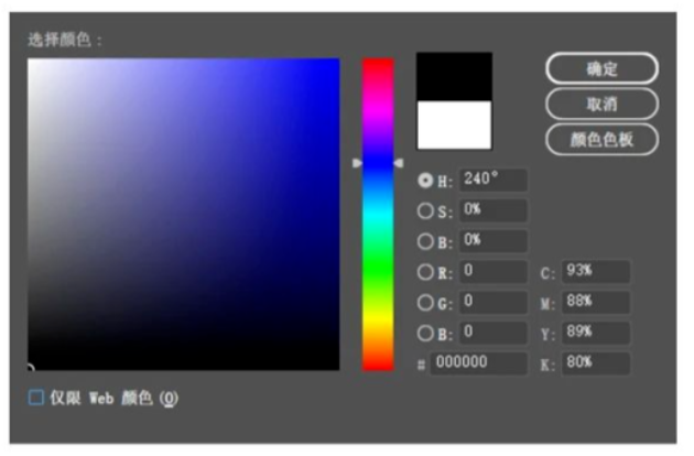
Set black
How should we set 'black'?
(1) Single color black is used for text and fine lines: C0, M0, Y0, K100.
In practical work, there are inevitably errors in color matching. If four-color black is used to print text and fine lines, any slight misalignment of cyan, red, yellow, and black will result in inaccurate matching of the text and fine lines.
(2) Using black extensively, if we continue to use monochrome black, the printed material will not be black enough and may appear slightly gray.
It can be set to C30, M0, Y0, K100, and the printed black color is more saturated and glossy; If color matching is needed, the total value of the four colors should be controlled at around 250.
How to avoid color pitfalls
(1) Colors that are prone to color cast should be avoided if possible, especially four-color gray.
(2) Purple, coffee, dark blue, orange, and gradient red, which are highly prone to color deviation, should not be used as base colors for large areas.
(3) If you really need to use the above colors as the base color, and the customer has high requirements for colors, then you can consider using spot color printing.

