


Color management considered a 'waste of effort'? Actually, it's just poor front-end management!
As the core technology system for color restoration, color management achieves full-chain color consistency from image acquisition and processing to output through standardized processes, holding significant value for the printing and packaging industry. However, in reality, many companies fail to achieve the expected results after applying color management, and some even shelved their software and hardware, resulting in significant waste. Therefore, many people refer to color management as a "stupidity tax." The reasons for this dilemma include the following:
(1) Current color management technologies are mainly suitable for static scenarios, requiring every participating device, substrate, ink, and even objective factors such as speed, temperature, and humidity to be in standard conditions, which are difficult to meet in actual production.
(2) Color management technology involves multiple professional fields and requires high professional competence from operators. Some industry practitioners lack systematic knowledge of color management and are not proficient in key steps such as equipment calibration and ICC profile creation, resulting in the color management system not being fully effective.
(3) Some equipment lacks sufficient precision and stability, leading to deviations in color conversion. Most practitioners already understand the above reasons and have certain countermeasures. But why do many companies still struggle to use color management? That's because front-end management is actually more important.
What is front-end management for color management?
What is front-end management of color management? It is literally what it means. In print shops, color management helps achieve color consistency across various printing equipment, but it can only achieve "consistency." As for whether this "consistency" is what the customer wants, color management is powerless. Therefore, some effort must be put into the front-end of color management to maximize its effectiveness.
The most important aspect of color management is the ICC standard, and printing is one of the industries with the most standards. Each order has different standards: old samples, other manufacturers' samples, digital samples, computer displays, mobile phone displays...... All sorts of things. Some are also on-site color matching between customers and designers. In this case, the standard is the customer's perspective, and this standard is dynamic. Sometimes, after adjusting multiple effects, the customer tells you to choose the first version effect. Faced with this situation, most printing factories are at a loss, so returning orders, revisions, and frequent proofing repeatedly fail not only cause huge waste but also worsen customer satisfaction, leading to customer loss.
To address these unwanted phenomena, I began researching countermeasures in 2017, visiting a large number of end customers, including several top-tier brands, and found that our standards were actually problematic. For example, when a customer placed an order, they gave us a sample and said to follow the sample. After much effort, we finally managed to get close, but the impression left by the customer was "these two printing factories are about the same level."
When I was chasing print sample orders, I noticed that the face of the person in the samples brought by the customer looked bluish and the fruit images looked gray. I asked the salesperson to communicate with the customer if they could make the portrait look rosier and the fruit fresher. The customer not only agreed but was also very happy, saying that printing better would be best. This successfully changed the printing standard from "following print samples" to "using samples as the basis, improving on the original figure and fruit images," greatly reducing operational difficulty. Later, we followed this method for every order, and over 90% of customers accepted our suggestions, with customer satisfaction steadily increasing. This is front-end management of color management, meaning the ICC standard is brought forward to the end customer stage. No matter what printing needs are, there is only one standard: to follow the customer's needs.
How can customer needs be met?
"Customer needs" is a very vague concept that is hard to quantify, which leads to weak operability. But after years of experimentation, the author has summarized some highly practical and detailed standards that must be followed in front-end processing of color management.
01/ Brand Attributes: Color needs to be strengthened for recognition and tone matching
(1) Core color locking: The brand logo color and standard colors must be reproduced 1:1, such as Coca-Cola red, Starbucks green, etc. Use spot colors to avoid color bias.
(2) Tone matching: For example, FMCG products should use highly saturated colors (dark, not light, fresh, but not dark) to attract consumers' attention; Maternal and infant products should use soft colors (lighter but not dark) to convey a sense of warmth.
02/ Scene Adaptation: Colors must match the function and audience
(1) Functional Compatibility: Food packaging often uses warm colors, which easily stimulate appetite; Daily chemical products often use refreshing cool colors to convey a sense of cleanliness.
(2) Audience Adaptation: Children's products often use bright color blocks to suit children's aesthetics; Senior products often use high-contrast colors for easy identification.
After understanding these relevant standards, combined with printing hue, layering, and saturation, the front-end processing will have a clear guideline. According to customer requirements, the actual printing effect will almost always show deviation, but we must grasp the direction of deviation: hue tends to be corrected and brighter, layering tends to be stronger, and saturation tends to be higher.
As shown in Figure 1, mineral water labels mainly use cool colors such as blue and dark blue. When setting printing standards, the color should lean toward cooler colors, preferably blue, avoiding reddish or purple tones (with a focus on adjusting hue).
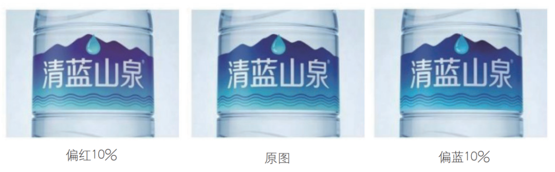
Figure 1 Mineral Water Label Design
As shown in the camera pattern in Figure 2, based on the client's original draft, try to increase the layers as much as possible to avoid the phenomenon of weakened layering.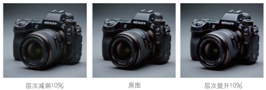
Figure 2 Camera Pattern
As someone working in printing, you should have at least a basic sense of aesthetics. When setting standards upfront for different clients' requirements, try to meet their aesthetic needs. Upgrade printing standards like sample matching, digital proof matching, and computer color matching to satisfy client demands. Once the front-end standards are set, combine them with color management techniques to maintain color consistency from digital proofing to finished printing, thereby improving efficiency, enhancing client satisfaction, and achieving a win-win outcome.