Dieline Releases Top 10 Packaging Design Trends for 2026
Recently, the global packaging design and creativity platform Dieline released its 2026 trend report, highlighting ten packaging design trends. Some of these trends directly respond to the accelerated development of artificial intelligence, some arise from consumer demands in the post-pandemic era, and others remind us that design and culture can still bring us joy.
Luminous packaging
Glow-in-the-dark packaging is no longer just a Halloween seasonal special; the demand for this type of luminous packaging is continuously growing.
Dieline believes this is because, in the post-pandemic era, consumers are more eager to find small moments of delight in everyday life. "Experience consumption" is spreading, and consumer brands are responding to this demand through interaction, creating a perfect opportunity for glow-in-the-dark packaging to shine. Additionally, Generation Z's desire for shareable visual elements and their nostalgia obsession means that glow-in-the-dark packaging has naturally captured a core place in this group's cultural identity.
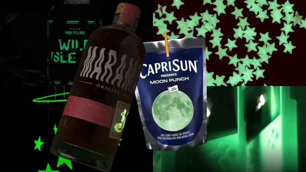
To attract consumers' attention, more and more brands are launching glow-in-the-dark packaging. From Capri Sun's lunar eclipse-themed pouches to Marama's glow-in-the-dark rum labels, as well as Daily Fresh's luminous bottles and Magnum ice cream's glow-in-the-dark ice pops, luminous packaging is gaining favor among both consumers and brands.
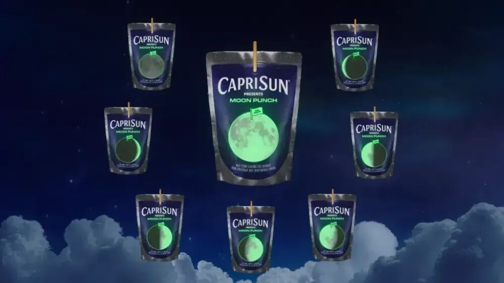
In early 2025, Capri Sun launched a glow-in-the-dark drink pouch called Moon Punch on the eve of a total lunar eclipse. A box contains 8 collectible pouches, each showcasing a different phase of the moon.
The packaging of Marama Rum tells a captivating story by incorporating luminous elements, with the mermaid (Marama means mermaid in the indigenous language) and skull patterns on the bottle standing out even more under the glow-in-the-dark design.

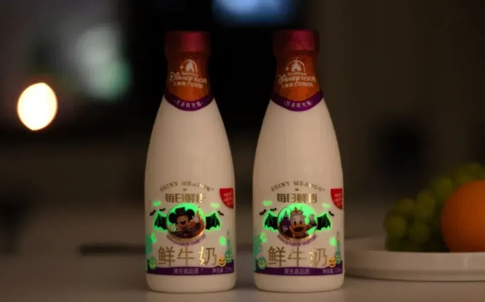
In China, as early as Halloween 2024, Daily Fresh teamed up with Shanghai Disney Resort to launch the 'Glow Bottle.' This 'Glow Bottle' features Mickey and Donald Duck in 'mysterious costumes.' During the day, the packaging absorbs natural light, and when night falls, it 'changes costumes' and glows.
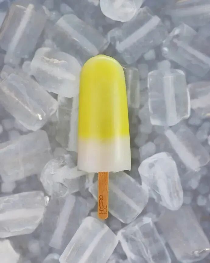
Glow-in-the-dark elements are not only used in product packaging but, even more so, are directly incorporated into the products themselves. In August of this year, Magnum Ice Cream launched a glow-in-the-dark popsicle called Hydro:ICE on Ibiza, specifically for summer party enthusiasts. The center of this popsicle is filled with glow-in-the-dark gel, enhancing the fun experience of party settings.
Simulated Texture Design
According to Dieline's forecast, by 2026, packaging with more texture will become increasingly popular, as brands rediscover the power of human-centered design. This trend reflects a reaction against a world saturated with algorithmic uniformity, rather than a rejection of technology.
Today, AI-generated images are ubiquitous, ranging from monotonous perfection to bizarre roughness. In this context, people are becoming more skeptical of AI-driven creativity, and trust and authenticity are becoming more significant purchase drivers across product categories. For example, charcoal-blended fonts, fountain pen ink lines, typewriter-style labels, and limited edition artist collaborations that hold collectible value rather than being mass-produced are all gaining popularity.
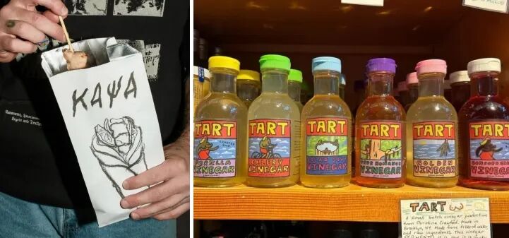
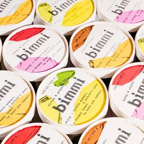
Dieline believes that handcrafted details reflect craftsmanship, effort, and creative intention. In today's cultural context, which increasingly values human autonomy, these qualities resonate even more.
Comic Design
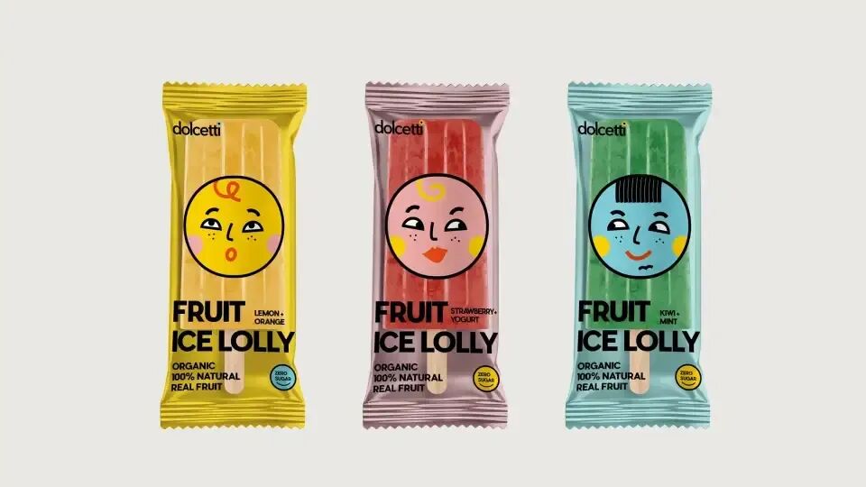
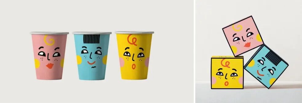
Nowadays, brands are increasingly leaning towards using expressive and vivid characters to showcase their brand personality, such as bold hand-drawn portraits or exaggerated, distinctive personas.
The ice cream brand Dolcetti centers around a series of lively and expressive faces, with brightly colored packaging like a canvas, giving each character its own display space. The striking sans-serif typography places the entire design layout within a clear visual hierarchy. The brand makes extensive use of illustrations, turning ice cream bars, boxes, cups, and even peripheral products into collectible, distinctive touchpoints. It maintains overall coherence while avoiding repetition; it is full of fun without feeling overdone.
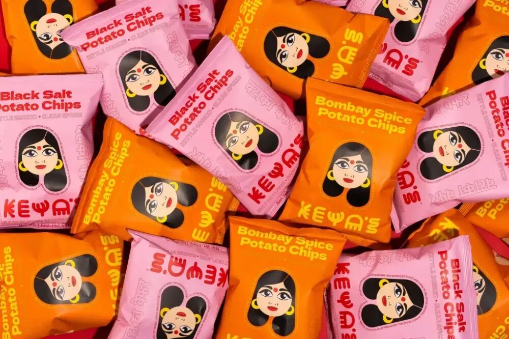
The snack brand Keya's Snacks uses packaging with large areas of highly saturated color blocks, primarily bright pink and saffron orange. The illustrated patterns serve both as the brand's mascot and as an eye-catching sign on the shelves. The fonts are large, geometric, and moderately spaced, alternating between English and Sanskrit. Keya's Snacks' packaging demonstrates that snacks can be bold, vibrant, and full of fun.
The packaging of the spirits brand KAVALERO is bolder and full of personality, completely different from the cartoon styles we often see. The illustrated characters on the KAVALERO bottles wrap around the body, adding just the right touch of mystery, featuring beards, red noses, and stern gazes, while not affecting the clarity of the information. The font design plays a supportive role, cleverly hidden within the cup-shaped outline resembling a mouth. From the tattoo-style ingredient list to the clean black-and-white color scheme, every detail is perfectly executed. It is bold and eye-catching, instantly recognizable even across a bar.
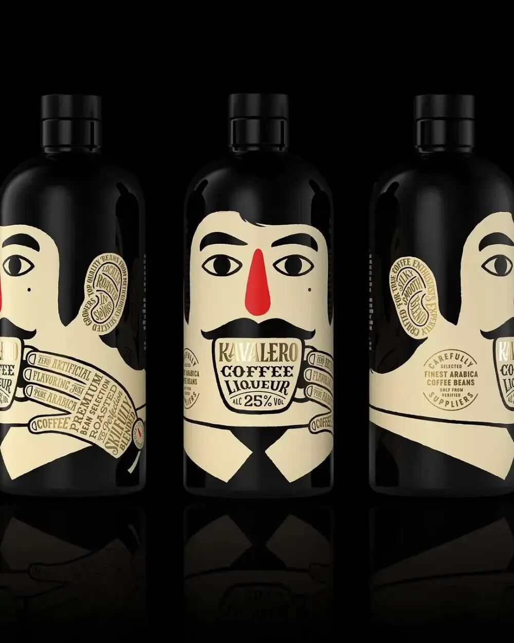
But Dieline emphasizes that when using this type of illustration, it's important to pay attention to technique. A good illustration can create a sense of ease, fun, and harmlessness, but if used improperly, it can spark controversy. Therefore, Dieline mentions in the trend report that creators should avoid clichés that only reinforce stereotypes.
Refined but Unpretentious
According to Dieline, in 2026, high-end packaging will no longer be exclusive to elites, and this type of packaging is evolving toward being 'refined but unpretentious.' It showcases luxury without creating a sense of distance, using high-quality materials and exquisite craftsmanship while incorporating warm and approachable elements.
For example, the redesigned Audrey's Chocolates retains its elegant style with beautiful paper, gold stamping, and meticulous attention to detail, yet it abandons any sense of exclusivity. It is high-end but not unattainable. The packaging conveys thoughtfulness, superb craftsmanship, and a luxurious experience, without the cold feeling traditionally associated with luxury products.

Dieline also noted that consumers' spending habits are currently undergoing a significant shift, moving from seeking flamboyance to focusing on inner quality. The widening gap between rich and poor, coupled with resentment toward the wealthy and the crisis in purchasing power, makes ostentatious design seem increasingly impractical. Therefore, the future of luxury packaging lies in creating an atmosphere that is pleasing rather than intimidating, combining luxurious textures with approachable fonts, inclusive imagery, and a tone that does not rely on performance to impress.
Rationality with Warmth
By 2026, the design trend of 'rationality with warmth' is expected to emerge. This style is sleek and avant-garde while incorporating just the right amount of human-centered care, making it feel more welcoming.
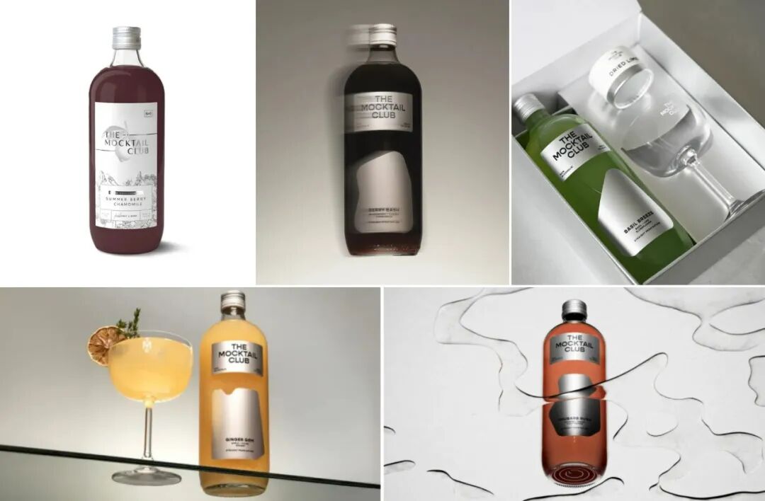
Dieline believes that the rise of this trend is largely due to the continued global dominance of South Korea's beauty and wellness industries. The iconic visual language of K-beauty is characterized by clean lines, functional messaging, gentle color accents, and ingredient-focused storytelling. This design philosophy is now permeating related fields like beverages, health supplements, and non-alcoholic cocktails. The Mocktail Club and VUUM are typical examples of this shift.
The Mocktail Club centers on minimalism, with eye-catching silver labels perfectly matching the refined style of its non-alcoholic cocktails. Smooth, droplet-shaped forms resemble sliced fruit or pouring liquid. The typography is simple and clear, with balanced spacing, allowing the product itself to take center stage without distraction. Silver, white, and black lay the foundation for a premium, minimalist look, while soft shades of green, pink, yellow, and red add a more feminine and festive touch.
VUUM focuses on ultimate functionality and clarity, with a metallic base providing a clean background for striking contrasting graphics. These graphics highlight the features of each product, including plant protein, caffeine, and flavors. The text is arranged in a staggered vertical and horizontal layout, guiding the eye across the can. Vibrant colors, prominent data, and layout clearly convey the product's functionality.
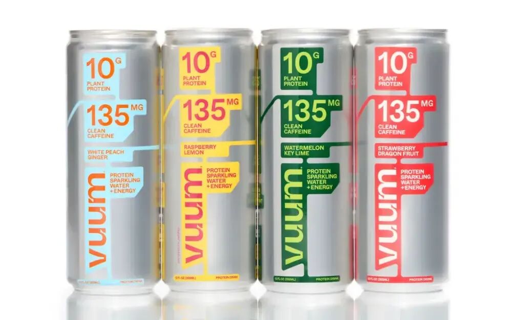
The redesigns of these two brands feature minimalism, an almost medical-style layout, metallic materials, and clear, straightforward functional information.
Rounded Corner Design
Dieline points out that the rounded corner design of packaging refers both to a structural design technique and a stylistic expression. It indicates that physical containers such as jars, bottles, boxes, and small bags adopt rounded corners or curved panels, making them more comfortable to touch and more ergonomic. It also refers to softer details in graphic and layout design, such as rounded corners on labels, buttons, or visual elements, which often use curves rather than sharp-edged squares, and layouts that lean toward curvature rather than rigid grids.
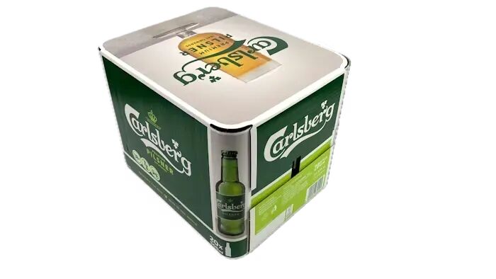
Dieline mentions in its trend report that rounded corner designs not only align with human brain preferences but can, to some extent, reduce greenhouse gas emissions and promote environmental protection. For example, in 2024, Carlsberg tested a new rounded corner multipack in Poland, which, compared to standard corrugated packaging, can reduce carbon dioxide emissions by 224 tons annually.
Form-Fitting Design
The trend report suggests that form-fitting packaging films are gradually becoming one of the most forward-looking design changes by 2026. This type of packaging can perfectly conform to the product itself.
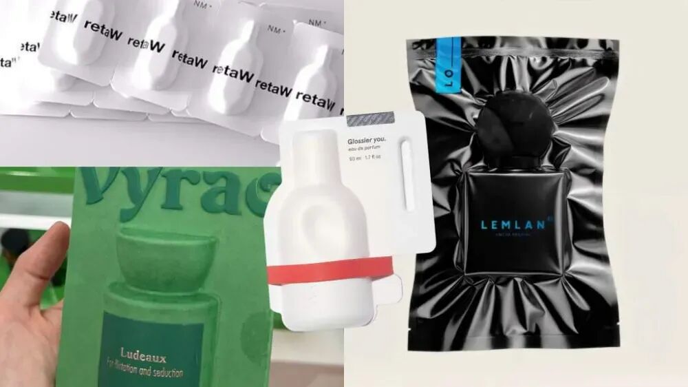
The container can closely fit the product's contours, and secondary packaging can effectively vacuum seal multi-item products. According to Dieline, this is both a visual design and a practical design, demonstrating that this aesthetic approach is neither wasteful nor arbitrary. The fact that the global vacuum packaging market reached $31.16 billion in 2024 and is expected to hit $50 billion by 2032 also validates the rise of this packaging method.
Today, consumers are increasingly demanding packaging that can preserve freshness, reduce oxidation, improve logistics, and minimize material waste. Flexible packaging and vacuum sealing systems are becoming more popular because they optimize packaging shapes and promote more sustainable and efficient supply chains. While this is partly due to a shift in aesthetics, Dieline believes the more important factor is that this self-adhesive packaging lowers costs, reduces carbon emissions, and enhances consumers' perception of product quality. Therefore, Dieline notes in its trend report that the momentum for this type of packaging will be very strong.
Visually, form-fitting packaging appears high-end and refined, almost meticulously designed. By eliminating all gaps, brands can better convey their design intent and create genuinely customized packaging, discarding any unnecessary embellishments.
Hyper Max
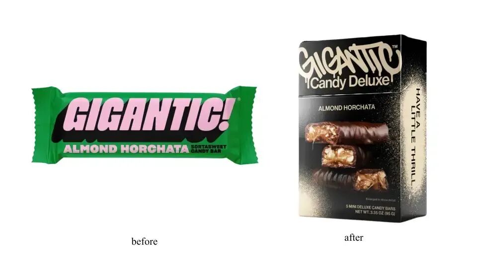
Dieline points out that Hyper Max represents a wave of branding in which companies embody their philosophy not only visually but also in language and structure. This trend is not about exaggerated spectacle but about brands pushing their narratives to the extreme, presenting them intentionally, humorously, dramatically, and with cultural depth.
For example, the brand redesign of Gigantic reflects this. Gigantic is a line of vegetarian and gluten-free candy bars. The new packaging adopts a darker, graffiti-style design, with the outer package resembling a cigarette box and featuring graffiti lettering reading "Gigantic Candy Deluxe".
There are also Sandboy's casual drinks, whose cans resemble vintage postcards from beach clubs. The simple white background highlights playful photographic works, such as a limbo-dancing queen surrounded by flames, and a golfer swinging next to dolphins. The font is clean and confident, allowing the images themselves to become the visual focus.
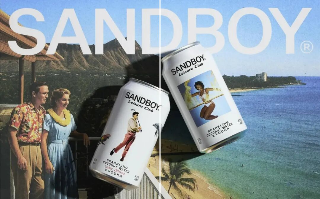
This maximally immersive thematic experience showcases distinct features at every touchpoint, especially among Gen Z, who favor humor and brands that 'take details seriously.'
Dopeymine
Brands are beginning to embrace humor and deliberate self-commentary. Now, the packaging itself tells a story, visual elements are intentionally exaggerated, and design choices become overly bold or flamboyant. For example, Burn Rate hot sauce wrapped in $100 bills; while not subtle, it playfully mocks consumerism, marketing, and life itself in an amusing way.
Dieline believes that young consumers, especially Generation Z, are increasingly savvy about marketing tactics. They are drawn to brands that openly acknowledge their true nature. This aesthetic caters to their desire to express authenticity through exaggeration, kitsch, and deliberate overstatement.
Take David's Cod as an example. This protein brand presents a highly masculine high-protein snack in a very serious manner. It's just cod, nothing more, yet its brand image and packaging carry no hint of humor. Four ordinary fish fillets sell for $69, packaged with the kind of seriousness usually reserved for luxury goods.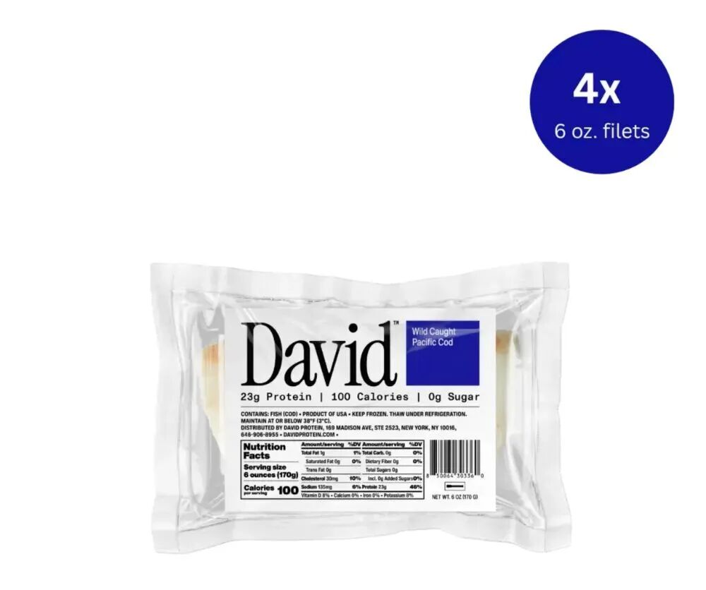
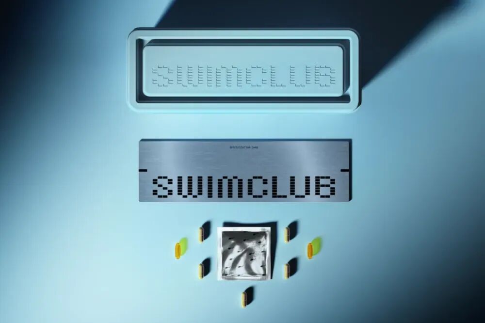
Take a look at Swim Club, a supplement related to male fertility. It uses 'swimming' as the theme for its entire visual world, taking the metaphor to the extreme in a way that is both clever and absurd.
Handcrafted Texture
Handwritten fonts are a subtle yet powerful way to help brands add a human touch to their visual identity without fully committing to an analog approach. Unlike the broader aesthetic that celebrates entirely handmade creations, handwritten fonts are more precise. The overall packaging can remain simple, refined, and well-crafted, but it is the font that gives it a raw and personalized feel.
This is exactly the case with Jolene, a bakery in London. Its logo was actually drawn by the six-year-old son of graphic designer Frith Kerr.
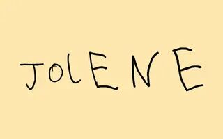
There is a reason why these small, human-touch details are becoming increasingly popular. As brand visual design becomes more streamlined and cohesive, teams are looking for subtle touches that can convey their creative intent. Handwritten fonts can create a sense of warmth, trust, and emotional closeness, quickly conveying authenticity without the need to craft a fully handmade brand logo.
This is not complete, chaotic imperfection, but a clever hint. Handwritten fonts indicate that a real person was involved, while still maintaining the polished look that consumers prefer.

