


Before printing, 3 easily overlooked profit points!
Prepress work is crucial, often impacting or even determining the printing and post-press processes. The seemingly insignificant prepress color separation work may surprisingly affect costs more than you think.
In this article, I'll use a sample from flexographic printing (as shown in Figure 1) to look at which operations have room for improving profits. Other types of printing can also refer to these experiences.
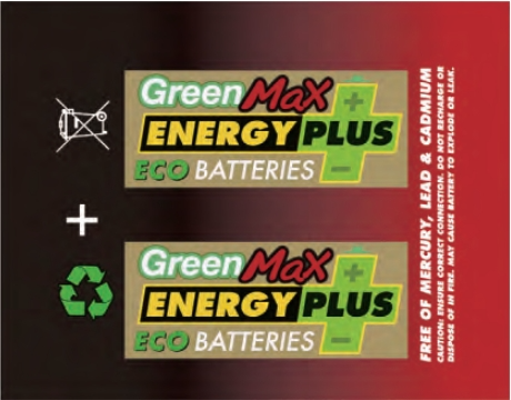
Figure 1 Example Draft
Spot Colors
The feature of spot color printing is that no matter how complex the CMYK components of a color block are, you only need to print one spot color for the entire block.
How to Do It
Designate a secondary or mixed color made from two or more primary colors of the product as a specific spot color, using a single color plate to present that color block. Before specifying a spot color, be sure to note the CMYK components of the original color and provide them to the ink mixer for reference. Figure 2 shows a green spot plate made for the example draft in Figure 1.
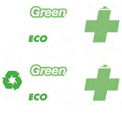 Figure 2 shows a green special edition made from the sample case.
Economic Benefits
(1) Using spot colors can reduce the number of printing passes. This is especially useful for fine patterns or reversed-out text, as it perfectly shows the contours and ensures product quality.
(2) Using spot colors can reduce the number of color plates. Converting two or more colors into one spot color decreases the number of plates needed, saving on plate-making costs.
(3) In dark areas, using spot colors reduces the total amount of ink, preventing color shifts caused by uneven printing of multiple inks, and makes drying easier, reducing smudging. In light areas, spot colors improve ink coverage on the substrate, avoiding dull colors, and also effectively solve issues like wrinkling caused by multi-color overlays.
White Fill
White gaps are mainly caused by mechanical errors and paper shrinkage. Since the influencing factors are complex and uncertain, the best solution is to fill in the white gaps during pre-press color separation.
How to Do It
(1) Common techniques for filling white gaps are spread and choke. It's important to note that these methods aren't chosen randomly; the decision depends on the colors of the two areas and the importance of the visual information in each area. Generally, two principles are followed: Firstly, extend the weaker coverage color toward the stronger coverage color, i.e., light colors toward dark colors. Secondly, extend from the main elements toward the secondary elements.
Figure 3 compares the expansion effects of the gold and green areas in the sample case. In Figure 3(a), when extending the gold, the green area shrinks. In Figure 3(b), when extending the green, the green area matches the original, with an additional dark overlay line, making the text look bolder. For printing elements with high precision requirements, like company logos, this needs special attention.
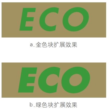
Figure 3 Comparison of the expanded effects of the gold block and the green block in the sample case.
(2) Reverse expansion. Reverse expansion is the opposite of the common white fill operation, meaning intentionally leaving some parts unprinted. This is especially common when using reflective paper as the substrate. When the overlapping colors of two blocks look very strong, we can choose a more muted substrate color to act as a transition between the two colors.
For example, when printing white and gold on aluminum film, the overlap of the two colors can create a bright yellow that looks very jarring. Using the natural color of the aluminum film instead can achieve a better visual effect (see Figure 4).

Figure 4: Display of Pre- and Post-Expansion Effects
The specific method is to reduce each of the two adjacent colors by half of the value used to fill white gaps, so that the two color blocks are slightly separated. At this point, a thin line of the substrate's color will appear on the printed material.
(3) Halftone Knockout. Halftone knockout refers to the method of using halftone percentages to balance colors and errors when two or more color blocks overlap. It is mainly applied where white, the natural color of the substrate, or light-colored small elements intersect with two or more dark color blocks.
The specific method is to apply percentage halftones to secondary colors in dark areas, with the halftone coverage determined by the color importance of the secondary color. For example, when printing small text on a block where 100% blue overlaps with 30% black, the black halftone can be reduced. The purpose is to reduce the registration requirements for the small text without causing significant color changes. Another common scenario is a two-color gradient, where the halftone coverage of the lighter color under dark or black areas can be reduced based on its color importance, thereby saving ink.
As shown in Figure 5, under very dark black areas, red halftones can be reduced or even removed. This not only reduces ink usage but also helps avoid registration issues between elements on the left, such as a checkmark and the environmental logo, and the red color.
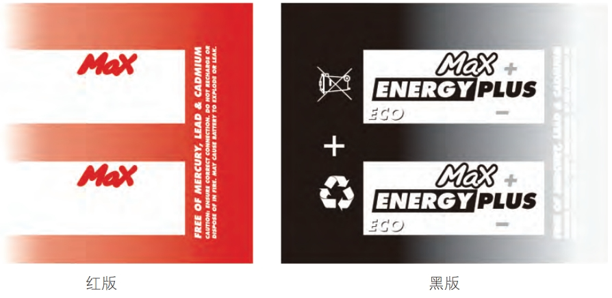 Figure 5 Dot Hollowing Effect
Economic Benefits
Good white touch-up work effectively solves the problem of misregistration, improving printability and ensuring product quality.
Color Overlay
The color overlay here refers to using one spot color with another primary color, or overlaying two spot colors to achieve the desired color. Generally, the colors chosen are those already used in the product.
Procedure
Before separating colors, carefully analyze the original artwork and divide the sample's colors into solid color blocks and halftone dot blocks.
(1) Solid color blocks. If the sample has solid color blocks, analyze how the color appears, especially whether it's printed on a white base or adjusted with spot colors. Also, pay attention to how you do touch-ups on the edge color blocks; different touch-up methods can yield different results.
(2) Halftone dot blocks. This is the key and challenging part of the color separation, because halftones have complex properties and many uncontrollable factors in the outcome. Here, you need to analyze the dot size, dot shape, dot angle, and line count one by one.
Economic Benefits
Using existing color plates to overlay and produce a third color can reduce the number of color plates and save costs. For example, as shown in Figure 6, by using the white, gold, and black that must be in the original artwork, yellow text and borders can be created through overlay.

Figure 6 shows screen printing color effects. First, a white base is applied under the gold, resulting in yellow, and then black is used to press out the text outline.
Clients often ask us to match colors according to the samples they provide. When copying, achieving an exactly identical effect is almost impossible, but we can try to keep any discrepancies within a range that ordinary clients won't notice. This way, we can replicate the sample's digital design as closely as possible, increase the chances of a successful proof, and save costs.